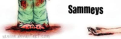
Pretty cool.
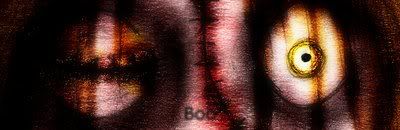
Try fixing the text and the image on the second picture. If you look closely, you can see the image is a little blurry.
Anywho, those sigs looks great!
They are pretty cool, the last one is just plain ugly (no offense). To be honest, I don't think the second one's text is bad. I still think the first one is the best however.
They are pretty cool, the last one is just plain ugly (no offense). To be honest, I don't think the second one's text is bad. I still think the first one is the best however.
This site uses cookies to help personalise content, tailor your experience and to keep you logged in if you register.
By continuing to use this site, you are consenting to our use of cookies.